

Above the "Add to Cart" button, place only the information necessary to understand the product, choose the right variant and buy without uncertainty: name, main profit, price, options, availability, delivery and concise reinsurance.
This area is not intended to contain the entire product sheet. It must answer the customer's immediate questions and leave detailed explanations, instructions for use and editorial content under the button.

In what order should the elements be presented?
The visitor should be able to identify the product, understand its interest and select an option without going through a long description. The exact order may vary by catalog, but this sequence provides a solid foundation.
Not everything matters the same
Information is worth placing above the button when it can change the choice, price, compatibility or ability to receive the product. The rest can be developed further down.
| Element | Recommended position | Why | Condition |
|---|---|---|---|
| Price | Above | Essential condition of purchase | Always clear and consistent with the variant |
| Size or format | Above | Determines the added product | Size guide accessible if necessary |
| Delivery | Summary above | Responds to an immediate objection | Deadline or threshold actually applicable |
| Full specifications | Under the button | Important, but often long | Report decisive data |
| History of the brand | Lower | Strengthens the universe without guiding the variant | Stay concise and relevant |
Present the main benefit without overburdening
Before the button, the benefit should help understand the usage, not replace the entire description. A main sentence and three short points are generally sufficient when each provides separate information.
Effective structure
Product + use + verifiable difference. For example: "500 ml insulated bottle designed to keep your drink at temperature while you travel. Screwed cap, compact size and stainless steel wall." Duration should only be added if it is actually documented.
Formulation to avoid
"The best water bottle on the market, completely waterproof and revolutionary" combines absolute assertions that are difficult to prove. It increases the promise without precisely answering the customer's question.
To learn more about this method, consult the guide present the benefits of a product without exaggerating and the one dedicated to the writing a compelling product description.
Price, variations and availability should work together
The button cannot compensate for a confusing selector. When a variation changes price, photo or availability, the change must be understandable before adding.
Make the options explicit
Use headings like "Size", "Color" or "Containment". Prefer "500 ml" to "Medium" if measurement is what really guides the choice. For a technical product, raise the compatibility or decisive dimension near the selector.
Avoid surprises
The displayed price must match the active selection. An unavailable option must be identifiable without requiring the customer to click the button to discover the error. The determining fees or conditions must not be presented in a misleading manner.
Help without multiplying controls
A size guide, a "How to choose?" link or a brief clarification may be enough. Adding multiple menus, boxes and windows before purchasing increases the decision load.
Adapt to the type of product
Above all, a single piece requires clear availability. A garment requires size and color. A professional product may require packaging, minimum quantity or price excluding taxes, if these rules actually apply.
What reinsurance information should I display?
Reinsurance is useful when responding to a concrete concern. It loses its value if it is reduced to a row of generic badges, if it repeats the footer or if it announces inaccurate conditions.
To favor
- A truly applicable delivery estimate or rule
- The return policy summarized with a link to the conditions
- The payment methods actually offered
- A real guarantee, with its accessible scope
- Manufacturing or stock information useful for the deadline
To be ruled out
- Fake stock or emergency meters
- Certifications not held or poorly presented
- Deadlines that are impossible to meet regularly
- Unproven superlatives
- Around ten pictograms that compete with the button
Two or three reliable elements are more convincing than an accumulation of promises. Consistency between this area, the policy pages and the experience actually proposed is a priority.
What to keep under the buy button?
Detailed content remains essential, especially for SEO and visitors who want to verify their decision. It simply needs to be organized after the shopping area.
Full description
Develop uses, secondary benefits, composition, maintenance and limits. Structure with headings, short lists and paragraphs readable on mobile.
Specifications
Dimensions, materials, references, compatibilities and contents of the package can take the form of a table or accordions, without hiding essential data of your choice.
Evidence and opinions
Place authentic reviews, manufacturing explanations and relevant evidence in an identifiable space. A review illustrates an individual experience; it does not guarantee the same result for everyone.
Advice and associated products
Add user guides, FAQs, compatible products or alternatives after securing understanding of the main offering.
Which service should you choose for your Shopify listings?
The need depends on the number of products, the state of the contents and the complexity of the variants. Standard formulas focus on the structure and integration of the elements provided; complete commercial writing or advanced adaptation requires a quote.
Choose according to actual work
Start with a priority batch if you want to validate a structure before extending it to the catalog.
Included in standard formulas: integration of content and media provided, product information, standard variants, Shopify organization, basic SEO and rendering control. Complete writing, advanced retouching, complex import, configurator, specific model or translation: on quote.
Checklist of the area before the button
- The product is identifiable from the first lines.
- The main benefit is based on verifiable information.
- The price corresponds to the active variant.
- Each option uses understandable wording.
- The active selection is visually identifiable.
- Unavailable options are clearly marked.
- The announced delivery corresponds to actual conditions.
- Returns or guarantees refer to accessible rules.
- The decisive information precedes the button.
- The button remains contrasted and readable on the phone.
- No badge provides non-existent proof.
- The area remains short despite the richness of the sheet.
FAQ about the purchase area of a product sheet
Do I have to put the entire description before Add to cart?
No. First present the main benefit and the information necessary for the choice. Detailed description, specifications and tips can be arranged under the button.
How many profits should be displayed above the button?
A main sentence and up to three short points are often enough. Each point must provide distinct and verifiable information, without repeating the title.
Should the delivery time appear there?
Yes when it influences the decision, provided that the estimate is reliable and corresponds to the destination or the rules actually applied by the store.
Where to place the size guide?
Place its link in close proximity to the size selector. The customer should not have to search for this information after attempting to add the product.
Should you display payment methods before the button?
A concise indication can be reassuring, but it should not compete with the main action. Only display the means actually available at the time of payment.
Should customer reviews be above the button?
A rating or link to reviews can help when they are authentic. The details of the reviews generally find their place better further down in the sheet.
Can we add a stock meter or an emergency?
Only if the information reflects real and up-to-date data. A fake meter or artificial emergency harms trust and can make the presentation misleading.
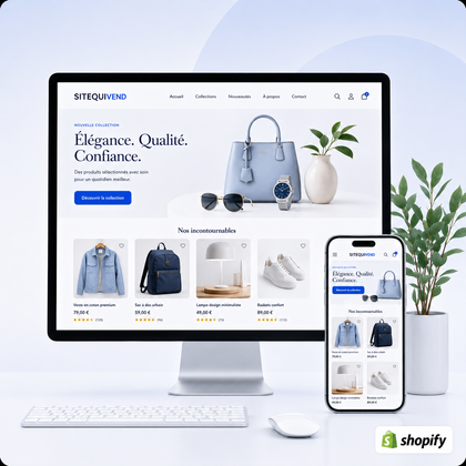
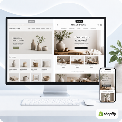
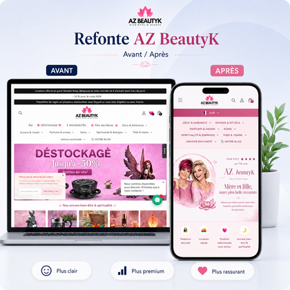
Can SiteQuiVend reorganize existing files?
Yes, depending on the condition of the catalog and the validated scope. Standard formulas mainly cover the structure and integration of the content provided; advanced work is costed on estimate.
Guide written by SiteQuiVend, specialist in the creation and redesign of websites and Shopify stores. Information updated in August 2026.
