
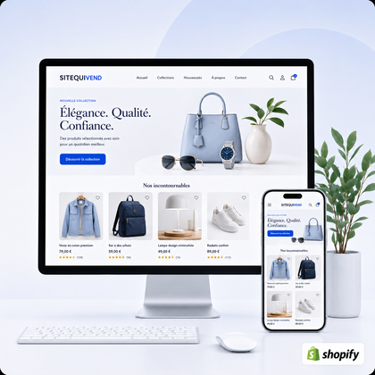
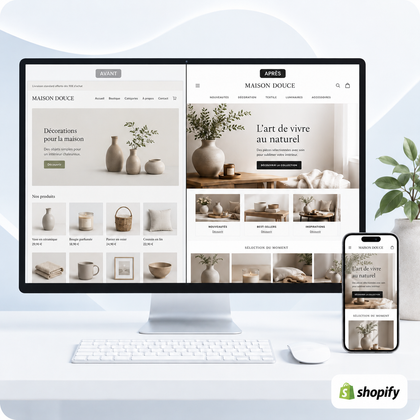
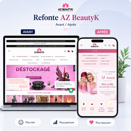
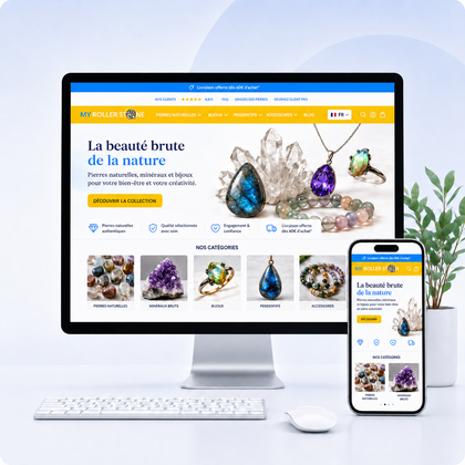
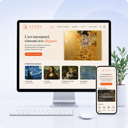

Design errors that cause you to lose confidence are those that create doubt before the visitor has even evaluated the offer. Inconsistent layout, difficult-to-read text, poor images, ambiguous buttons, or essential information that cannot be found make it seem like a poorly controlled site.

Guide written by SiteQuiVend, specialist in the creation and redesign of websites and Shopify stores. Information updated in August 2026.
What flaws make a visitor doubt?
A visitor does not always say "this site is poorly designed". Rather, he feels a hesitation: the business seems less serious, the purchase seems risky or the next step is not easy.
| Signal observed | Print created | Priority correction | Level |
|---|---|---|---|
| Different styles depending on the pages | Site assembled without method | Standardize colors, buttons, cards and titles | High |
| Pale text or too small | Information difficult to verify | Strengthen contrast, size and spacing | Urgent |
| Blurry or distorted photos | Neglected or unreliable offer | Replace and crop essential visuals | High |
| Hidden practical information | Risk of unpleasant surprises | Make contact, prices and conditions accessible | Urgent |
| Broken or cluttered mobile | Unmaintained site | Fix overflows, buttons and forms | Urgent |
1. An inconsistent visual identity
Changing color, font, border radius, or button style with each section feels like no one is in control of the whole thing.
Too many competing styles
Limit colors, fonts and card formats. A component with the same function must maintain the same appearance.
Unpredictable hierarchy
A subtitle should not appear more important than the section title. Organize sizes, weights and spaces on a repeatable scale.
Excessive decorative effects
Multiple shadows, animations, and icons distract attention. Each effect must clarify a priority or state.
Design unrelated to the offer
A visual universe must support positioning. A very playful style for a demanding service or very luxurious for a simple offer can create a gap.
To establish common rules, consult the Shopify Visual Identity Guide and the choice of professional fonts.
2. A text that is difficult to read or navigate
A site can look aesthetically pleasing on a model and become painful in a real-life situation. Light gray, tiny bodies and text placed directly on a photograph reduce understanding.
Insufficient contrast
Shopify recommends a ratio of at least 4.5:1 for body and buttons, and 3:1 for large texts. Also check field borders, icons and text on images.
Paragraphs too dense
Shorten lines, air out groups, and use useful subtitles. A large mass of text without reference suggests significant effort even before reading.
Text centered everywhere
Centering is suitable for short hooks. On multiple lines, left alignment provides a stable starting point and makes visual scanning easier.
Links difficult to recognize
Links and focus states must remain visually distinct, including on the keyboard.
References: accessibility of Shopify themes and WCAG 2.2 from W3C.
3. Images that weaken supply
The visitor uses the images to judge quality, consistency and seriousness. They must show what is actually offered, without creating a misleading visual promise.
Blur and stretch
An enlarged image that is too small, poor ratio or excessive compression immediately gives a neglected appearance.
Incompatible styles
Mixing dark photos, white highlights, illustrations and image banks without a common rule fragments identity.
Generic visuals
Too impersonal photography proves nothing about your business. Prefer your products, your team or a truly representative context.
Broken or empty image
An unloaded location may suggest a broader technical flaw. Control resources after any migration or theme changes.
5. Absent, vague or artificial reinsurance
Credibility is based on verifiable information: company identity, means of contact, prices, delivery, returns, conditions, scope of service and following steps.
Information difficult to find
Don't hide practical elements in a complex footer. Place the answers when they influence the decision.
Absolute promises
"Guaranteed result", permanent urgency or unverifiable numbers often produce the opposite effect.
Decorative badges
A padlock icon or five stars without explanation proves nothing. An element of trust must correspond to real and accessible information.
Questionable reviews or counters
Never invent testimonials, number of customers or remaining stock. Transparency protects reputation better than false social proof.
6. A poorly controlled mobile or form
A visible mobile defect suggests the site is unmaintained. Test around 375 px, without limiting yourself to the home page.
Horizontal overflow
Tables, images, banners and widgets should never push content off-screen. A partially hidden button also becomes difficult to use.
Touch areas too small
Space out links and expand important actions. Fingers don't have the precision of a mouse pointer.
Intimidating form
Request only the necessary data, explain usage and display errors near the relevant field. A long form for no reason creates distrust.
Technical messages
A raw error, an inactive button without explanation, or validation erasing fields feels like a fragile process.
The guide enhance a Shopify store's mobile experience complete these checks. If the defects concern several models, also consult signs of a store that has become unprofessional.
Which SiteQuiVend service should you choose?
Three targeted recommendations to identify priorities. This first diagnosis does not replace a complete technical, marketing and editorial audit.
3 simple requests within the limit of one hour, with first response announced within 48 to 72 working hours. New pages and complete redesigns are separated.
5 key pages or models, up to 10 products and 3 collections, with an indicative deadline of 5 to 7 working days after receipt of the necessary elements.
Specific functionalities, complex development, migration, tunnel or non-volume needs are evaluated separately before intervention.
Checklist to check visual confidence
The 14 priority controls
- Colors and fonts are consistent.
- The title levels are clearly distinct.
- The current text achieves sufficient contrast.
- The buttons keep the same visual role.
- Images are sharp and undistorted.
- No images or icons are broken.
- The menu uses explicit titles.
- Each section has a dominant action.
- Prices, contact and conditions are accessible.
- No social proof is made up.
- Site does not create artificial emergency.
- The form asks for what is strictly necessary.
- The page remains usable at 375 px.
- The complete route was tested before publication.
FAQ: design and visitor trust
Which design mistake causes you to lose the most confidence?
The most serious error is that which prevents you from verifying essential information: price, identity, conditions, availability, contact or next step.
Does an old site necessarily seem unreliable?
No. A sober style can remain credible if it is coherent, readable, fast and maintained. Inconsistencies and functional defects age more than a simple aesthetic.
Should we redo the entire site to make it more credible?
Not always. A few targeted corrections may be enough if the structure is healthy. A redesign becomes relevant when several models and paths have the same defects.
Do animations strengthen professional image?
Only if they explain a state or make it easier to understand. Too many decorative movements slow down reading and can give the impression of instability.
How do you know if the colors are readable enough?
Measure the contrast between text and background. Shopify recommends at least 4.5:1 for body and buttons, and 3:1 for large texts.
What reinsurance elements should be displayed?
Show only real information: contact, payment, delivery, returns, applicable warranties, service steps and responses to main objections.
Why does mobile influence trust so much?
On a small screen, defects become more visible: cut content, buttons that are difficult to touch, blocking pop-ups, painful forms or information that cannot be found.
Can a mini-audit identify these issues?
Yes, the SiteQuiVend mini-audit provides three priority recommendations. This is a first targeted diagnosis, not a complete technical, marketing and editorial audit.
