
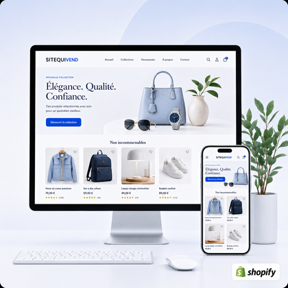
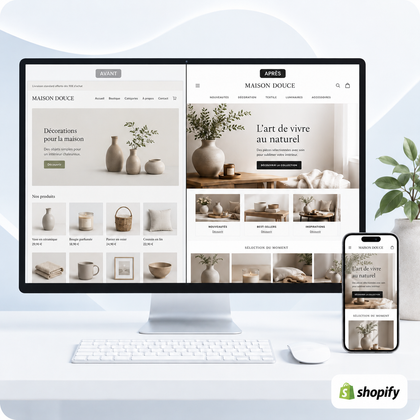
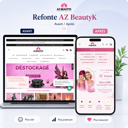
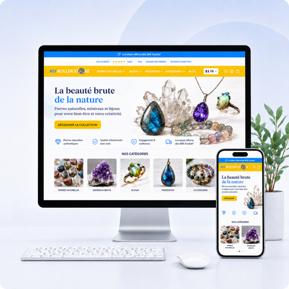
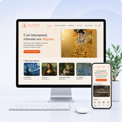

An online store must above all use simple, explicit and hierarchical buttons: "Add to cart" on the product sheet, "Proceed to payment" in the cart, "Discover the collection" to guide navigation and "Ask for advice" when support is really useful. The best button is not the most original: it is the one that clearly indicates the next step.

What is an action button actually for?
An action button, or CTA, turns an intention into a concrete step. It can move towards purchasing, open a collection, add a product to the cart, request information or finalize an order. Its effectiveness depends as much on its location and wording as on its color.
The most useful rule is simple: a screen should have obvious priority. On an available product sheet, the main action is generally adding to cart. The link to the size guide, sharing or adding to favorites remains secondary. In the basket, priority becomes payment.
The essential buttons of an online store
Add to cart
This is the main CTA of the product sheet. It should remain visible after selecting variants and clearly indicate if an option is missing.
Proceed to payment
In the basket, this button unambiguously leads to checkout. Avoid making it look the same as "Continue shopping".
Discover the collection
On the home page or an editorial page, it directs towards a precise selection. A concrete title is better than a vague "Learn more".
Ask for advice
Useful for technical, customizable or high-involvement products. It completes the purchase without unnecessarily replacing the main button.
Notify me of the return
For an unavailable product, the return to stock alert gives an honest next step instead of leaving a buy button inactive.
See my order
After purchase, tracking actions should be separate from commercial CTAs and accurately describe the destination.
Which button to use depending on the page?
The same visitor does not have the same intention on the welcome, a collection or a product sheet. The hierarchy must therefore evolve over the course.
| Page | Main action | Secondary action possible | To avoid |
|---|---|---|---|
| Home | Discover a specific collection or offer | See what's new | Several competing buttons in the same banner |
| Collection | View the product | Filter or sort | A quick purchase without sufficient information |
| Product sheet | Add to cart | Size guide or advice | Social CTAs more visible than purchasing |
| Basket | Proceed to payment | Continue shopping | An external promotion that diverts from checkout |
| Blog article | Discover the relevant product or service | Read a linked guide | A commercial button unrelated to the subject |
How to write wording that makes you want to click?
The text must announce the immediate result of the click. Start with an action verb, keep it brief and avoid excessive promises. "See summer dresses" is more informative than "Click here". "Receive the guide" is more accurate than "Send".
Design, contrast and mobile: the rules to respect
Reserve the most visible color for the priority CTA and use a more discreet style for secondary actions. A button should be recognizable as a clickable element, with a comfortable click area, readable text, and visible state when hovering or focusing.
On mobile, the main button should remain easy to reach without hiding important information. A full width often works well, as long as you maintain side margins and don't stack multiple fixed bars. Also check long variations, enlarged texts and translations.
Mistakes that weaken calls to action
Color everything
If each button catches the eye so much, none indicates priority. Keep a dominant color for the main action.
Change vocabulary
"Buy", "Order" and "Add" should not randomly designate the same step. Consistency is reassuring.
Hide conditions
A CTA should not replace the pricing, delivery, availability or variation information necessary for the decision.
Optimize reception only
The product sheet and the basket are often closer to conversion. Their hierarchy deserves priority attention.
For a broader view of the journey, also read how to improve Shopify shopping cart and why visitors leave a store without buying.
Which service should you choose to improve your CTAs?
Free mini-audit
Suitable if you want to identify some visible priorities before considering a broader intervention.
Optimization of product sheets
Choose when the problem focuses on product presentation, hierarchy around purchase, and clarity of information.
Shopify store redesign
Relevant if the CTAs, navigation, collections, product sheets and basket must be harmonized together.
Personalized request
Present the context, the pages concerned and the technical constraints in order to receive an appropriate recommendation.
Practical checklist before publishing your buttons
- A single main action dominates each screen.
- The wording describes precisely the next step.
- The main CTA contrasts with the background without losing readability.
- Secondary actions are visually more discreet.
- The button remains usable at 375 px width.
- Variations and errors display a clear instruction.
- The click leads to the announced destination.
- Keyboard and focus allow you to use the button.
- Price, delivery and availability remain visible before purchase.
- The route is tested from reception until confirmation.
e-commerce action button FAQs
What color should I use for an Add to Cart button?
Use a color that is sufficiently contrasted with the product sheet environment and reserve it for the main action. There is no universally winning color: consistency with the brand and readability matter more.
Should you write "Buy now" or "Add to cart"?
"Add to cart" corresponds to the classic route which allows you to continue shopping. "Buy now" is only suitable if the click actually leads to a direct purchasing journey and if this acceleration is useful.
How many buttons can be displayed on a product sheet?
There can be several actions, but only one must dominate. The purchase remains main; the size guide, advice, favorites or sharing should be secondary and clearly differentiated.
Is a fixed button at the bottom of the screen recommended on mobile?
It can make it easier to add to cart on a long product sheet, as long as you don't hide content, variant choices or important messages. It must be tested on several screen sizes.
Can icons be used without text?
For common actions like shopping cart or search, an icon can work if its meaning is obvious and accessible wording is provided. For decisive action, explicit text remains preferable.
Where to place the main button on a product sheet?
Place it near the price, variations and information necessary for the decision, in the quickly visible part. It must appear after the mandatory choices and before the very detailed secondary content.
How do I know if a CTA needs to be changed?
Analyze clicks, dropouts, and user feedback, then first check the clarity of the journey. Test one change at a time: wording, contrast, position, or hierarchy, to understand its effect.
Transform your buttons into clear steps along the way
SiteQuiVend can examine the hierarchy of your CTAs, your product sheets and your purchasing journey in order to guide you towards targeted optimization or a more global redesign, depending on the real state of the store.
